Zen simplicity, serious power.
An interface that feels calm and almost invisible, so you can focus on your events and your community.
Sign upIncluded on every plan, Seva included.
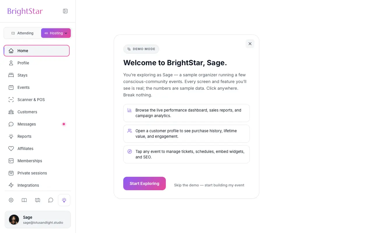
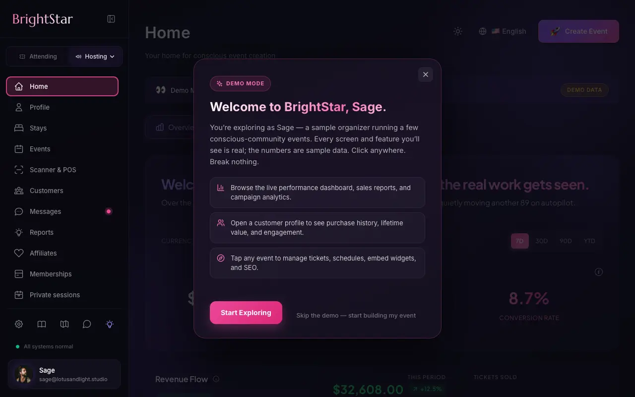
Simplicity as a form of respect
Clarity over cleverness
Labels say what they mean and actions do what they say. No jargon.
Progressive disclosure
Simple by default; advanced tools appear when you are ready for them.
No dark patterns
No fake countdowns, no manipulative notifications, no confusing unsubscribe flows.
How it feels
Creating an event
A guided wizard, one step at a time, with AI drafting you can edit.
Buying a ticket
Select, enter details, pay. No account required, wallets supported.
At the door
Open the scanner, point at the QR code, done.
Loved by artists and organizers
“For nearly two decades, Akal (owner of BrightStar) has been lending his skills and talents in support of the Bhakti movement. His platform uniquely serves our movement with authenticity and heart. The technology also rocks!”

Jai UttalGrammy Nominee (Client Since 2014)
“Not only does BrightStar offer a powerful software platform that has worked very well for my events, but their client support is the best. Their communication is personal, heart-centered, and always thoughtful.”

Peter KaterTwo-Time Grammy Winner (Client Since 2014)
“We've been so happy with the outstanding customer service that we've received while working with BrightStar, and feel great about supporting a company that is authentically committed to the ideals of higher consciousness.”

Eric ForbisFounder, BuddhaFest (Client Since 2012)
Questions organizers ask
How do you balance simplicity with powerful features?
Core actions take a click or two. Advanced features are there when you need them but stay out of your way until then.
How do you handle complex setups?
Wizards break multi-day festivals, retreats with rooms and recurring classes into simple steps, and you can save and return.
What about checkout for buyers?
A few steps, no account required, and Apple Pay or Google Pay where available.
Read more
Design as a form of respect
Software for events often treats attention as something to capture. Countdown clocks that reset when the page reloads. Messages that five other people are looking at this ticket. Boxes ticked in advance. These tricks sell a few more tickets and cost the trust of the people who notice. BrightStar was built for communities where trust is the whole basis of the gathering, so its design follows a different rule: say what is true, ask once, and stay out of the way.
For the organizer: one step at a time
Creating an event is a guided sequence. Each step asks for one kind of thing: the basics, the date and place, the tickets, the page. You can stop at any point and come back, because your work is kept as a draft. A simple evening passes through a few steps. The same sequence opens further steps for a retreat with rooms or a festival with many ticket types, so the tool grows with what you are making without confronting a beginner with everything at once.
Simple first, more when you want it
Most settings start in a sensible state, and optional tools are a single switch that opens only when you turn it on. A host who never needs discount codes never has to look at their options. This is what designers call progressive disclosure, and in practice it means that the screen in front of you contains what your event uses and little else.
Words that say what they mean
Labels are written in plain language. A button that publishes says Publish. A setting that hides a ticket says so. Where a choice has a consequence, such as who pays the fees, the screen states it. Help is drafted by AI where that saves you time, for instance a description or a set of FAQs, and it is always offered as a draft for you to edit, never published for you.
For the buyer: a short path
Buying a ticket is three movements: choose, give your details, pay. A buyer does not have to create an account or set a password to book. Wallets such as Apple Pay and Google Pay are offered on devices that have them, and pay-over-time options from providers such as Klarna, Afterpay and Affirm appear where Stripe offers them for the buyer and the order. The order summary shows the tickets, any fees and the total before the buyer pays.
No manufactured urgency
BrightStar does not show invented scarcity. If a page says that few tickets remain, it is because few remain. Reminder emails for an unfinished checkout are warm and limited in number, and they stop when the person books. An offer to a departing visitor appears once and closes with one tap.
Email that can be turned down
Every marketing email from BrightStar carries a link to a preferences page that opens without a login. There, a reader can keep the kinds of email they want and switch off the rest, or unsubscribe from everything promotional. One click is enough to unsubscribe. Tickets and receipts are sent regardless, because a buyer needs them.
Consent before tracking
Visitors are asked for their choice before advertising and analytics tags run, and the choice is respected. An organizer’s own pixels follow the same rule.
At the door
The door is where calm matters most. A helper opens the Organizer app, picks the event and points the phone at a QR code. The answer is immediate and unambiguous: admitted, already checked in, or not valid for this event. A guest without their code is found by name. A mistaken check-in can be undone, after a confirmation, so a stray tap does not cause a problem.
After the purchase
A guest’s tickets are in their confirmation email and in their account. From the order they can add the event to a calendar, share a ticket where the organizer allows it, and write to the organizer. Reminders arrive with the ticket inside them, so on the day there is nothing to search for.
Light and dark, large and small
Pages follow the reader’s light or dark setting and are laid out for phones first. Text is set at sizes that can be read without zooming, and tap targets are large enough for a thumb.
Languages
Public pages, checkout and emails are available in seven languages. A visitor’s choice of language is remembered.
What simplicity is not
Simple does not mean limited. Assigned seating, rooms, custom questions, waivers, affiliates and reports are all present. The work of the design is that you meet each of them only when your event calls for it.
Why it matters commercially
Respectful design is not only a matter of principle. A guest who was not tricked comes back, and recommends you. An organizer who is not fighting their tools has attention left for the gathering itself. This approach to design is part of every plan, including Seva.
Ticket Categories
Group your ticket types into clear categories, so buyers see the shape of your event and find their ticket fast.
See the feature →Assigned Seating
Buyers pick their exact seat from a clear, live map, and the seat is theirs the moment they pay.
See the feature →Custom Questions
Add your own questions to checkout and every answer arrives tied to the right attendee, ready to export.
See the feature →Coupon Codes
Codes that open and close on your event's own clock, cover only the tickets you choose, and show you what each one sold.
See the feature →Smart Pricing
Get a suggested price for every ticket type, based on similar events near you, and decide for yourself.
See the feature →Ticket Sharing
Buyers share tickets with the people coming along, and each person gets their own QR code for the door.
See the feature →See allThere is more to see.